The colors you use in fabric painting are incredibly powerful and affect how we perceive a piece. Even if you’re painting the same design, different colors can give you a completely different mood, as you can create something that feels calm, vibrant, sophisticated, or fun, just by changing up your colors.
There are some basic principles you can follow when selecting your colors. These will help you put together a textile design that feels harmonious.
Pick a Palette
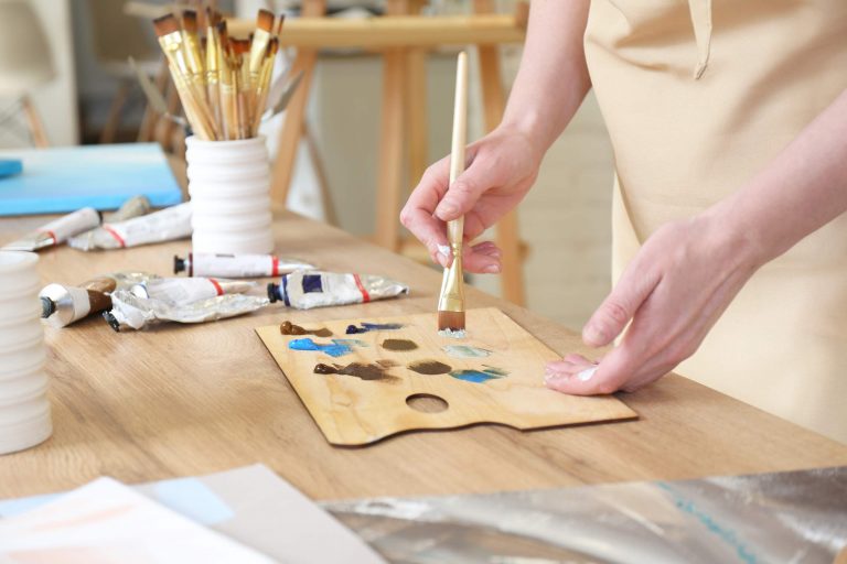
Rather than picking colors as you paint, start by picking a palette first.
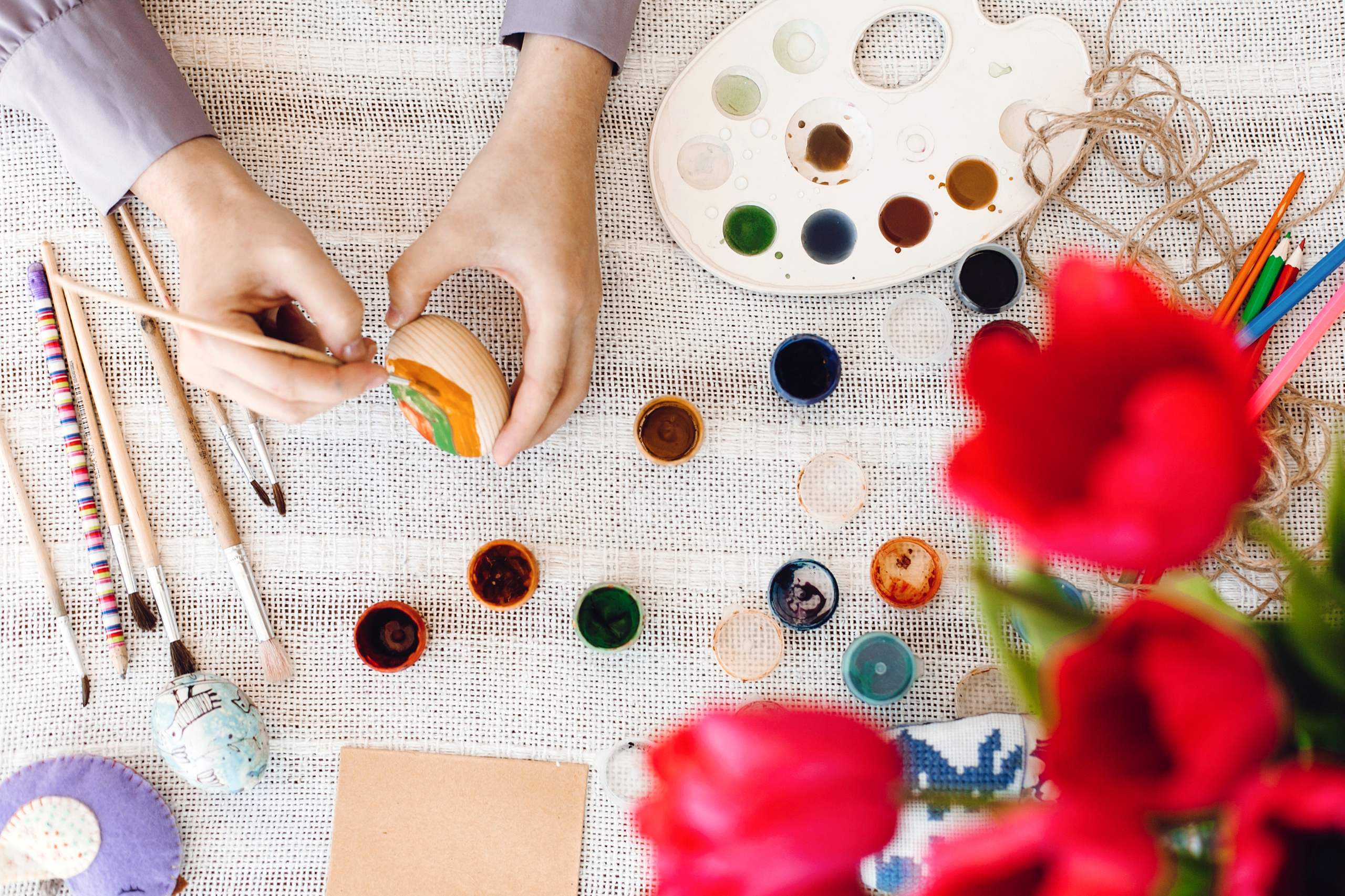
For a simple painting, a palette of 3-5 main colors should be plenty. You can always add other colors by modifying those.
Why Limit Yourself?
If you use too many random colors in your painting, your design might end up looking a bit cluttered. Having fewer colors will help keep the design cohesive and consistent.
Know Warm and Cool
Many colors fall into two categories: warm and cool.
Warm
Warm colors include reds, oranges, and yellows. These can convey energy and warmth. They tend to feel very vibrant and bright. If you want to make your painting catch the eye, warm colors are a great option.
Cool
Cool colors include blues, greens, and many shades of purples. These colors tend to give off a more relaxed vibe. They can also help create a feeling of depth. Using warm and cool colors together can be really effective if done right.
Use Contrast Wisely
Contrast is a helpful tool to make certain parts of your design pop out.
A dark shape against a light background will definitely get your eye to notice it, but two colors that are similar in value won’t grab your attention as much and will feel softer.
Lightness and Darkness
In addition to considering the actual color, think about whether the color is going to be light or dark. High contrast between light and dark can help make your painting more legible from a distance.
Consider the Color of the Fabric
Don’t forget about the fabric! The color of the fabric can actually affect your painting quite a lot. A painting on a white fabric will likely look completely different from one painted on black, beige, blue, or another colored surface. Some fabric paints may also appear more transparent or muted depending on the background color.
When possible, test the colors on the actual fabric before you start painting the actual design.
Make the Painting Look More Three-Dimensional
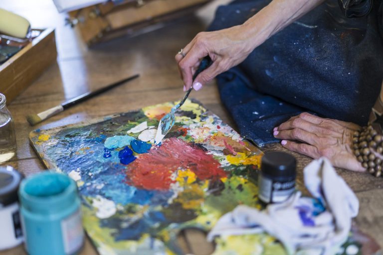
You don’t have to use a huge number of colors to give the illusion of depth in your fabric painting. Sometimes, all you have to do is modify your base color by adding a bit of lighter or darker color to it. You can use this to create highlights, shadows, gradients, and variations.
For instance, a shade of green can be made lighter to represent the illuminated part of a leaf and darker to represent the deeper part of the same leaf.
Think About the Mood
Color plays a big role in how people perceive your artwork. Soft colors can make a painting feel understated and serene, while brighter colors can make your painting feel energetic and lively.
Think about the mood you want your painting to convey before you choose your palette.
Try the Colors First
Make a color swatch on some scrap fabric and place your selected colors side by side on it. Wait until they’re dry to see what the final combination looks like.
You’ll be able to see which colors go well together and which ones don’t.
Use Color as an Aid
Color theory isn’t a set of hard-and-fast rules, but rather a way of thinking about color choices. Experiment with different colors, note down what works on different types of fabrics, and slowly create your own palette of colors.